
Aussie67
Well-Known Member
I'm liking this.
 www.streetmachine.com.au
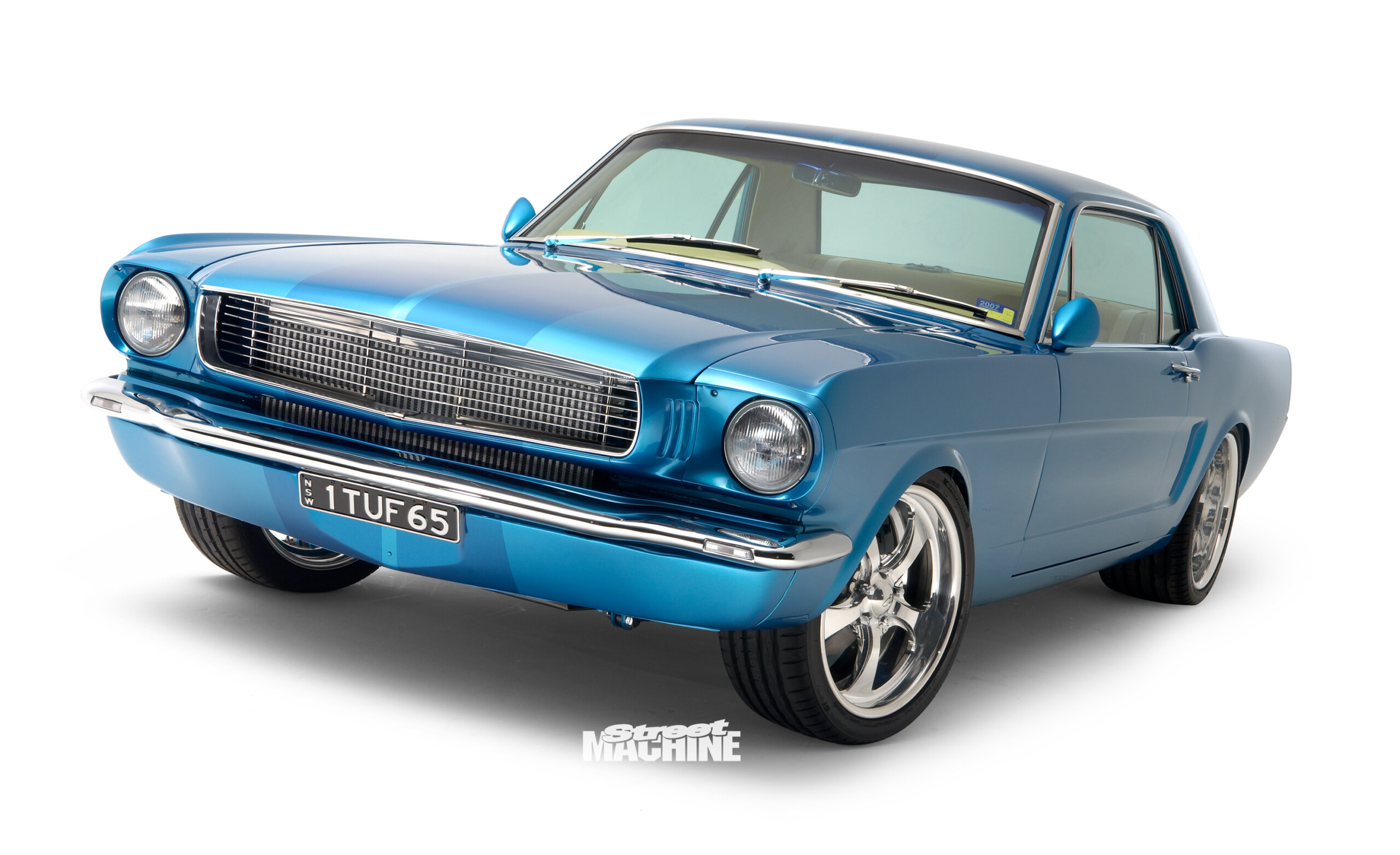
Twin-turbo 1965 Ford Mustang
Chosen by the punters as the coolest ride at Summernats 20, this stunning Mustang was built to be driven, not hidden
www.streetmachine.com.au
![[.]](/styles/default/xenforo/smilies/censored.gif "Censored [.]")
") But the built on his own is incredible. My 2 eurocent.
But the built on his own is incredible. My 2 eurocent.